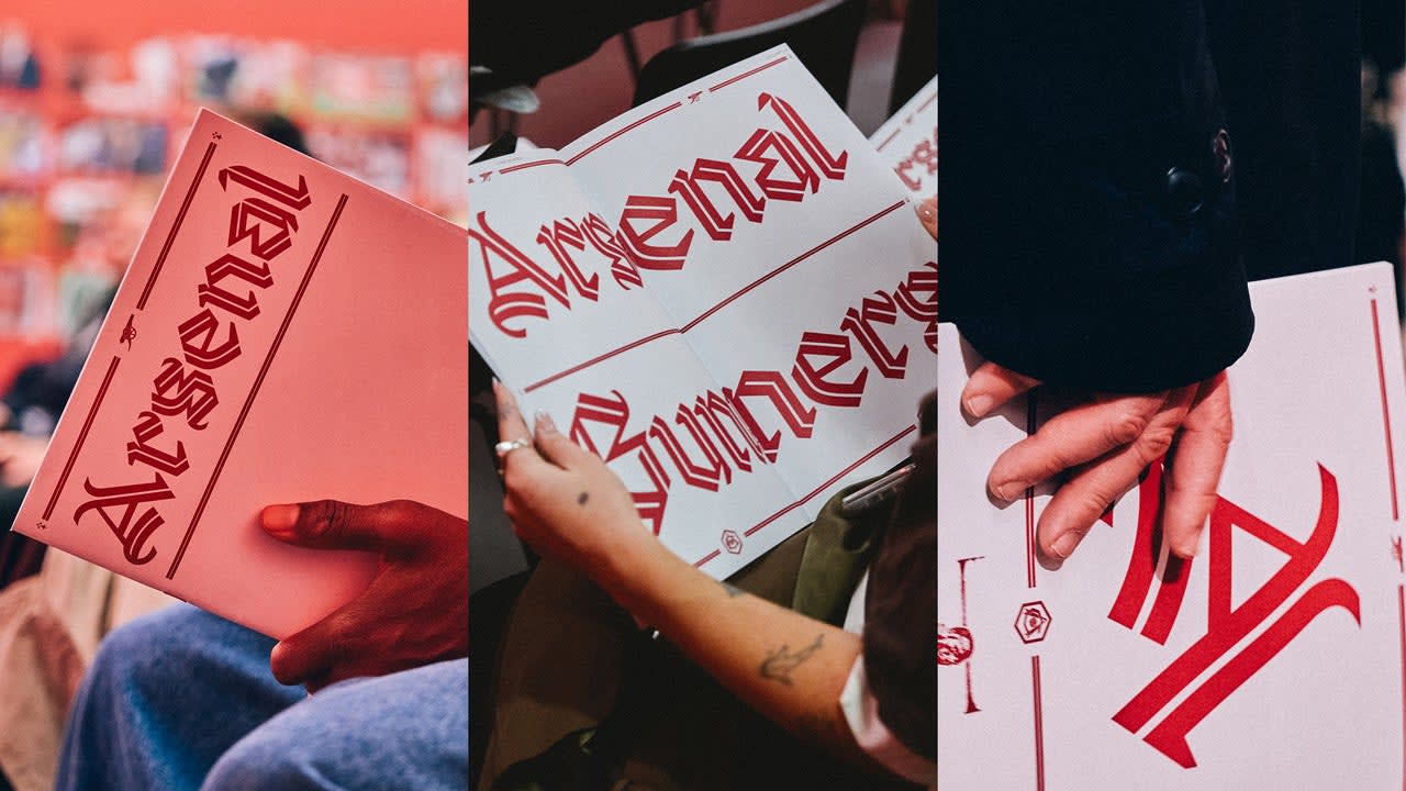

Arsenal’s new gothic font is a modern take on black letter. It’s part of a larger multi-font branding strategy for the 140-year-old English football club.
The team unveiled its new font, Rocastle, at a pop-up exhibition this month at the Design Museum , in London. It’s named for the beloved late Arsenal player David Rocastle (1967–2001), also known as Rocky, and was created by David Rudnick, founder of the research and design studio terrain , with Léa Bruneau.
[Type Design: terrain. studio/David Rudnick with Léa Bruneau]
Rudnick—an Arsenal fan who says “I would only ever have worked with one club” —is also the architect behind the club’s new, bespoke font book developed over the past four years. For Rocastle, he sought an aesthetic that felt distinctly English and custom-tailored to the team.
The font has to do “a lot of very difficult contradictory things,” Rudnick tells Fast Company . “It had to be sufficiently distinctive and bold and proud as a set of letterforms that it functioned as a kind of glorious pinnacle of the identity, but it also had to be simple, legible, modern, and applicable enough to function in the way that a modern typeface would.”
[Type Design: terrain. studio/David Rudnick with Léa Bruneau]
The letterform is unmistakably black letter, but a mix of elements like an inline weight and swashes that recall the shape and flow of pennants in the wind, make it feel modern and English. “You create the sense of something that feels more chivalric or knightly,” Rudnick says.
[Type Design: terrain. studio/David Rudnick with Léa Bruneau]
Arsenal began updating its typography in 2022, and Rudnick designed three fonts licensed exclusively to the team around three pillars: team, community, and culture. Rocastle represents “culture,” or “where football intersects with fashion, art, music, and more,” according to a curator statement from the exhibition. It’s a font that would work in a fashion drop or, say, on the walls of a pop-up design museum show; contemporary but heritage.
[Type Design: terrain. studio/David Rudnick with Léa Bruneau]
The team assembled hundreds of pieces of Arsenal memorabilia and type specimen during the research phase of the four-year project. The Rocastle font—along with a blackletter “A” mark that’s now one of the club’s three primary logos alongside its crest and cannon—is inspired by the lettering in the club’s retro VCC crest ( Victoria Concordia Crescit , victory grows through harmony).
[Photo: Josh Upton/courtesy Arsenal Football Club]
Rudnick’s first font for the club in 2022 was Northbank, a bold, thick sans-serif font. It appears in all caps in player names, words in animations like “Goal” and “Believe” that show up on stadium video screens , and “We Are the Arsenal” signage at the club’s training facility. The designer built it using letterforms from signage on the club’s old Highbury Stadium. Northbank represents the “team” pillar, and a superbold version of it was designed “so that any other club that wants to go into a shouting match with us can’t win,” Rudnick says.
The second font, Chapman, released in 2023, is a humanist sans-serif font that’s used in sentence case and designed for the club’s “community” pillar. It’s meant for “the days, weeks, months outside of the game where you’re anticipating the match, you’re reading the program,” Rudnick says.
[Photo: Josh Upton/courtesy Arsenal Football Club]
Rocastle, meanwhile, communicates the club’s “deep past and far future,” Rudnick says. For Arsenal, competition extends to graphic design.
“There will be people whose great grandparents went to Arsenal, people whose ancestors that were never alive in their lifetime who love the club,” he continues. “This is us declaring boldly to other institutions, even other companies, we outlive you and we will outlast you.”
[Photo: Josh Upton/courtesy Arsenal Football Club]
Some online commenters have criticized the font’s legibility, a common concern when historic typographic elements are adapted for modern use . But this isn’t a font made for dense text or heavy use; it’s an accent the club can pull out for special moments and creative collaborations.
“It gives us the freedom to take the club forward creatively while staying true to who we are,” Arsenal’s creative studio lead, Johnnie Campbell, said of Rocastle in a statement.
Arsenal’s multifont strategy shows a team that’s being thoughtful about the way typography can speak to fans. With Rocastle, they’re thinking far beyond just game day.