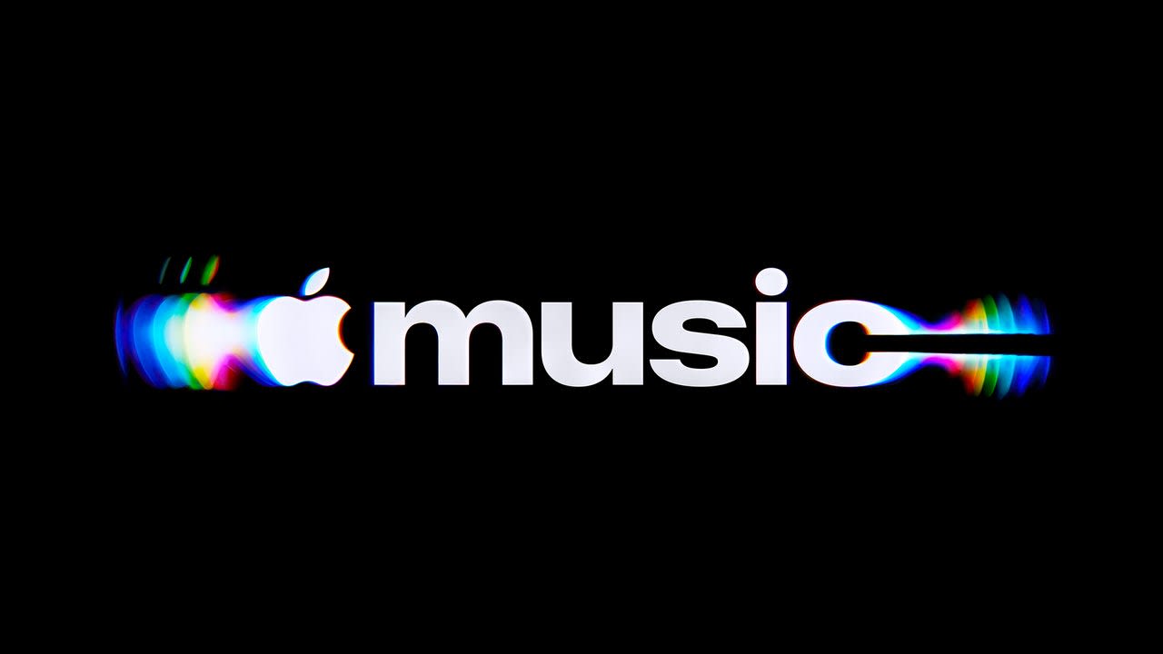

Apple Music just unveiled a rebrand that’s literally made out of sound.
[Image: Apple]
The new brand—which includes a new wordmark, a custom sonic logo, and a rippling visual language—was created through a partnership between the team at Apple Music, the bespoke design agency TBWAMedia Arts Lab (MAL) , the music producer Fred again.. , and his collaborator Nest Acoustics. It will begin appearing across Apple Music’s original content and event programming this week, and will later roll out to Apple Music’s marketing , product, and experiences.
To represent a brand as massive as Apple Music, the new look and sound needed to be universal enough to encompass the breadth of the platform’s service, but distinct enough to be instantly recognizable. Achieving that effect was a months-long process that required mineral oil, acrylic props, and lots and lots of liquid.
[Image: Apple]
How Apple Music made its new branding by hand
When the Apple Music team set out to design a new identity, they knew they wanted it to look like it was constructed out of actual music. And, similar to the approach taken by the broader company with its new identity for Apple TV back in late 2025, they also knew they wanted to make it happen with practical effects. The question, then, became how to develop a signature sound that users could also visualize. The answer? Ripples.
First, the team built a custom rig and software to control a transducer—a device that converts an audio signal into physical vibration. Then, the transducer was used to play various frequencies into a liquid bath. The musicians and engineers went back and forth, trying different sounds and notes and watching how the liquid responded.
Those first tests established some specific constraints, both for the visual language and the sonic logo. Too many notes, or notes pitched too high, created excessive movement and made the image hard to read. That gave the musicians a core framework to arrange the sonic logo.
Once the final composition was complete, it was time to put the initial research into practice by converting the sonic logo into a visual ripple pattern. To do that, the transducer was placed into a bath of mineral oil—chosen for its viscosity, which gave the impression of glass being rippled by sound. Inside the oil bath, the team submerged acrylic versions of Apple Music’s note logo and wordmark (which, as part of the rebrand, has been updated with a custom, chunky version of SF Pro, Apple’s typeface).
When the transducer played the song into the bath, the liquid waved and refracted light over the logos, which was captured on film. Each note is reminiscent of light playing over an oil spill, bringing out brief bursts of saturated color.
The final result manages to take subtle cues from Apple’s broader branding —including Li q uid Glass and the Apple TV identity—while still hitting a distinct note that’s true for Apple Music.